 | |||||||||||||||
ARCHIVE
2010
apr days
• color
concept &
theory widgets and apps
mar days
• red:
a portrait of a artist rothko
feb days
• talking
heads as figure/ground
jan days
• tanja's
black light dance party
dec days
• tootsie roll pop wrappers colors & flavors
nov days
• stephen vitiello's four color sound
oct days
• atmospheric perspective
sept days
• a rainbow
of antioxidants
colors
aug days
• floor stain colorants
jul days
• minimal colors
jun days
• wildflowers cataloged by color
may days
• tennis court colors
apr days
• morandi's neutral colors
mar days
• grid colorists
feb days
• black as
film noir
jan days
• flood of toxic minerals used in paints
ARCHIVE
2008
dec days
• complementary
colors
nov days
• kettle korn
packaging color change
oct days
• green fluorescent protein
sept days
• red palms - not green
aug days
• blue tunes
jul days
• “blue” - textile museum
jun days
• “fiesta- ware”
colorants
may days
• “blue alchemy” hive gallery
apr days
• “sennelier” selecting
watercolours for travel
“sennelier” selecting
watercolours for travel
Sennelier
Aquarelle Extra-Fine Watercolours
Z.I. 2, rue Lamarck - BP 204
22 002 St-Brieuc Cedex
France
image on left
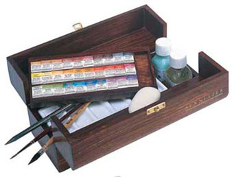
The Sennelier Aquarelle Watercolour set comes with 30 watercolour pans – too many colors and too heavy for convenient portability.
LINK to Sennelier Aquarelle
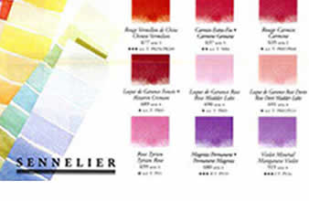
image on left
Setting up Sennelier watercolor travel set
The challenge was to select 12 colors from a 20 colour set of watercolours for my Portugal/Spain painting travel kit.
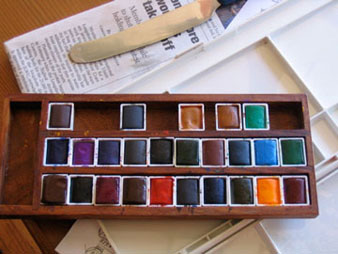
The first 6 colors selected were easily decided: the primary (red, yellow, blue) and secondary (orange, green, violet) colors. All the other paint colors had to be tested.
Seeing these colors within pans does not reveal their true color quality and level of transparency. Follow link to see the process: LINK
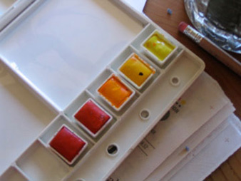
image on left
Deselecting watercolor pans
As I tested each color, I marked the colors from the list. while following this procedure, I realized the colors were not in numerical order but rather setup from warm to cool.
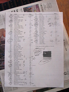
This method of selecting colors was easy to figure out until I had to decide on the neutral colors. I relied on the Sennelier Chart for this sequence.
image on left
Sennelier Chart
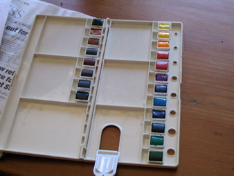
image on left
rejected colors
These were the 10 colors rejected colors: some too transparent or could readily be made from other colors or were mighty similar to a color I had selected.
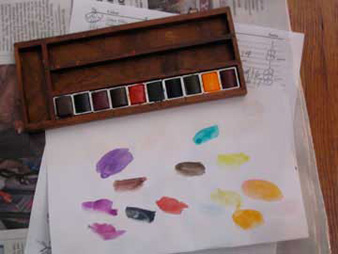
image on left
testing out the colors one by one